
Have you ever scrolled through social media and instantly recognized an ad without seeing the logo, just from the colors or style? That's visual consistency in action. It works quietly in the background, helping brands become more familiar and trustworthy in a world full of distraction. Yet, achieving it isn’t always as automatic as it might appear. Sometimes a tiny detail—an off-shade, a weird font, or a misplaced logo—can break the effect. This guide will walk through practical steps and a bit of the reality marketers face trying to anchor their brand identity in the digital sea. And honestly, sometimes it’s harder than it looks.
Understanding the basics of visual consistency
Let’s start simple. Visual consistency is about keeping the visual elements of your ads—the colors, fonts, images, and layout—in harmony across all campaigns and platforms. If your audience can spot your ad with just a quick glance, you’re probably doing this right.
The Forbes Communications Council highlights that a consistent visual identity creates brand recognition, builds trust, and even customer loyalty. It’s not only about beauty. It’s about being memorable to real people.
Why consistency matters more than ever
Think back to your own habits. Honestly, how many ads do you ignore each day? Visual consistency can be the difference between being overlooked and catching attention. When a user recognizes your visuals, they pause, even for a second. That second might be all you need.
- Consistent brands are remembered more easily.
- Trust often grows when audiences see the same style or colors repeatedly.
- Loyalty builds as people feel more comfortable with what’s familiar.
These effects show up, especially for teams that test and iterate ads quickly—like those using platforms such as Automads, which help create fast, brand-aligned creatives in seconds.
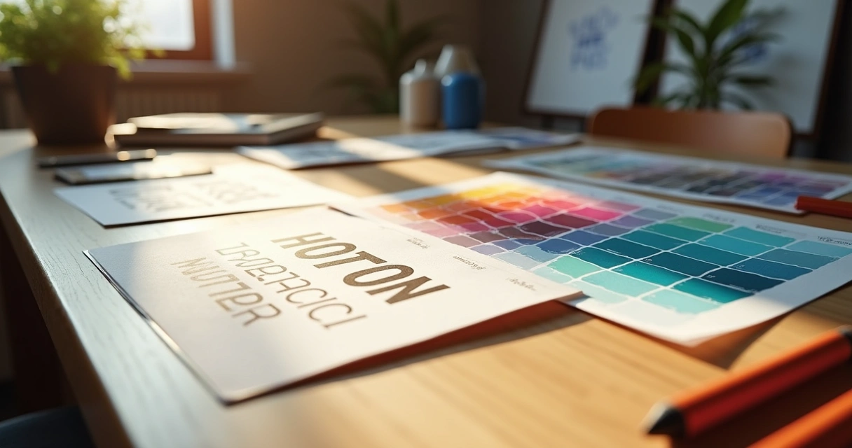
Building the base: your brand guide
Everything starts with having clear rules—your brand guide. Without it, every designer or marketer works from their own instincts, and chaos can creep in. Sometimes the process feels like herding cats. But once you have a simple reference manual, things get much easier.
A good brand guide will include:
- Your main and secondary colors, with color codes (HEX, RGB, or CMYK).
- Correct logo usage, protected space, minimum size.
- Font families, sizes, and when to use each one.
- Guidelines for photography or illustrations (do’s and don’ts).
- A sample layout structure for ads—just a wireframe can save headaches.
I’ve seen teams skip the last point—layout guidelines. That’s when banners start looking like distant cousins, not siblings. And yes, a messy feed is what usually follows.
Keys to visual consistency in digital ads
Stick to your palette and fonts
Your colors and fonts are your outfit and your voice—change them too often, and people don’t know who you are. Choose a palette with a few main colors and some accents. Choose one or two fonts. Then repeat them. Every. Single. Time.
Logo matters (but don’t overdo it)
Your logo needs to show up, but not scream. Use your defined logo variations and sizes from the brand guide. Remember, a giant logo can annoy, but a tiny one is pointless.
Image and video style should “feel” like you
If your brand is playful, keep images cheerful and energetic. If it’s luxury, images should look high-end, maybe even a bit reserved. Tools like the AI ad creative generator from Automads can help reinforce your style by generating variations using your preferences.
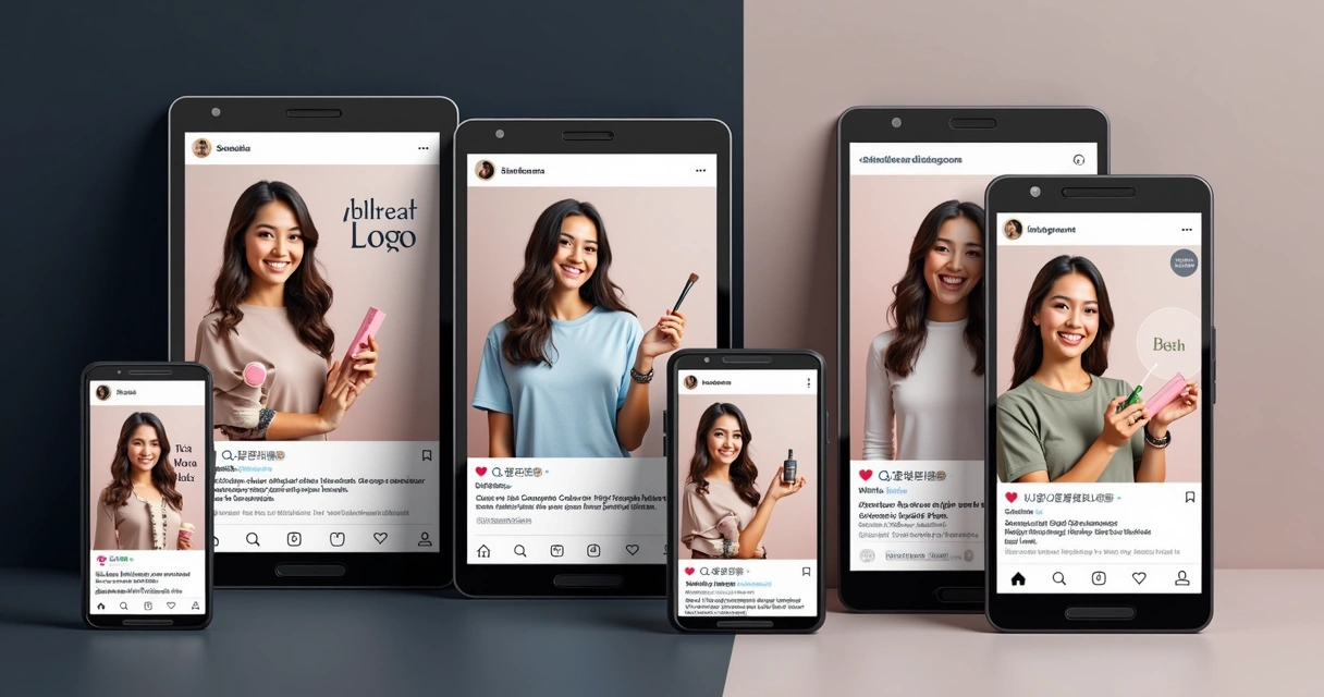
Consistency on every platform
Your ad on Facebook shouldn’t look totally different from the ad on Instagram or Google. Consistent elements should cross these boundaries. Of course, you may tweak the layout to fit different sizes, but the “vibe” needs to stay.
Templates: your shortcut to better consistency
Templates remove the need to reinvent with each new ad. Start with a set of well-designed templates in your editing platform or agency workflow. Swap images out, update text, but keep the style anchored. The less you have to improvise, the more steady your brand appears.
For Meta platforms, using the AI Meta Ads generator is a smart way to automate templates while staying true to your original visual identity.
Testing and variation: how much is too much?
Testing new angles and messages is good. Too much variation, though, and your audience might get confused. There’s a middle ground. For every experiment, keep the backbone the same—the colors, logo placement, and fonts.
Test new ideas without breaking your core look.
Platforms such as Automads can generate many ad variations but keep things tied to your brand standards. You can try different messages or even AI-generated actors but still keep a steady visual line. If you want a specific focus, like Facebook or Instagram ads, try the Facebook ad generator or the Instagram ad generator to speed things up, especially if your goal is to quickly test looks but prevent a visual mess.
Making consistency practical: routines for teams
Sometimes even the clearest brand guide gathers digital dust. For real consistency, integrate it into teams’ daily work. A few routines help:
- Have a shared folder with current brand assets, templates, and guides.
- Review new ads before launch—a short checklist can catch random mistakes before they go public.
- Train everyone—designers, marketers, even freelancers—on what “on-brand” really means.
- Update your brand guide as you adjust your branding or campaigns, and communicate changes quickly.
- Automate when possible. For Google Ads, the AI Google Ad generator saves time and keeps teams from wandering off-brand by accident.
Maybe not every team does this perfectly. Sometimes revisions slip through or someone uses “almost the same” blue. But with routines, it happens much less.
Small mistakes that break consistency (and how to fix them)
- Wrong logo version—always double check before exporting your ad creative.
- Inconsistent photography styles—stick to your approved gallery and themes.
- Random font swaps—lock your design files if possible.
- Color mismatches—use defined color codes, not eye-dropper guesses.
Honestly, most errors are simple. A final team review or using automation tools that enforce brand standards—such as those available via Automads—can fix most of them before they go live.
Conclusion: keep your brand recognizable
Visual consistency helps audiences recognize, trust, and choose your brand in busy digital spaces. Sure, it takes clear rules, a bit of team discipline, and routines, but it doesn’t have to feel overwhelming. With a strong brand guide, a set of reusable templates, and the right automation tools, you can multiply your ad variations while keeping everything “on brand.”
Your brand is a promise. Keep it visible, keep it steady.
If you want to speed up your creative process and make staying consistent almost effortless, try creating ads with Automads. No credit card, just your ideas and your brand. Make your next campaign more memorable and more effective.
Frequently asked questions about visual consistency in ads
What is visual consistency in ads?
Visual consistency means using the same colors, fonts, logos, and design style across all advertising materials. It helps your audience recognize your brand quickly, even without reading your name. Sticking to a consistent look across platforms and campaigns makes your ads stand out as unmistakably yours.
How to keep ads visually consistent?
First, create a clear brand guide covering colors, fonts, logo usage, and image style. Use templates tailored to different ad formats. Make sure your team has easy access to these assets. Some brands use automation platforms like Automads to generate ads aligned with their brand standards, reducing the risk of mistakes and saving time.
Why is visual consistency important?
When your ads look the same everywhere, people remember your brand, trust you more, and are more likely to become loyal customers. According to the Forbes Communications Council, a steady brand identity builds recognition, trust, and long-term connections with your audience.
What are the best tools for ad design?
The best tools simplify ad creation and help enforce your brand’s rules. Platforms like Automads provide AI-powered ad generators for Facebook, Instagram, Google, and Meta, helping teams create many brand-aligned variations in seconds without endless manual editing. Templates and drag-and-drop design interfaces are also very popular among marketers.
How can I choose ad colors?
Start with your brand palette. Choose one primary color and a couple of accents. These should reflect your brand’s personality and be easy to recognize. Use color codes (like HEX) for precision. Avoid randomly picking new colors for each campaign. Consistent use builds recognition and makes your ads unforgettable over time.